December 23, 2011

Sequential Project...

Sequential Imagery Project...


My sequential imagery project was done in 3 sequential stages on one entire picture...the water is the main idea where I am trying to reach out to the audience togive the message - help save our environment by recycling, reducing, and reusing. There are many ideas I am trying to promote in one project: recycle plastic bottles, reduce use of water and plastic bottle use, and reuse by using glass water bottles.

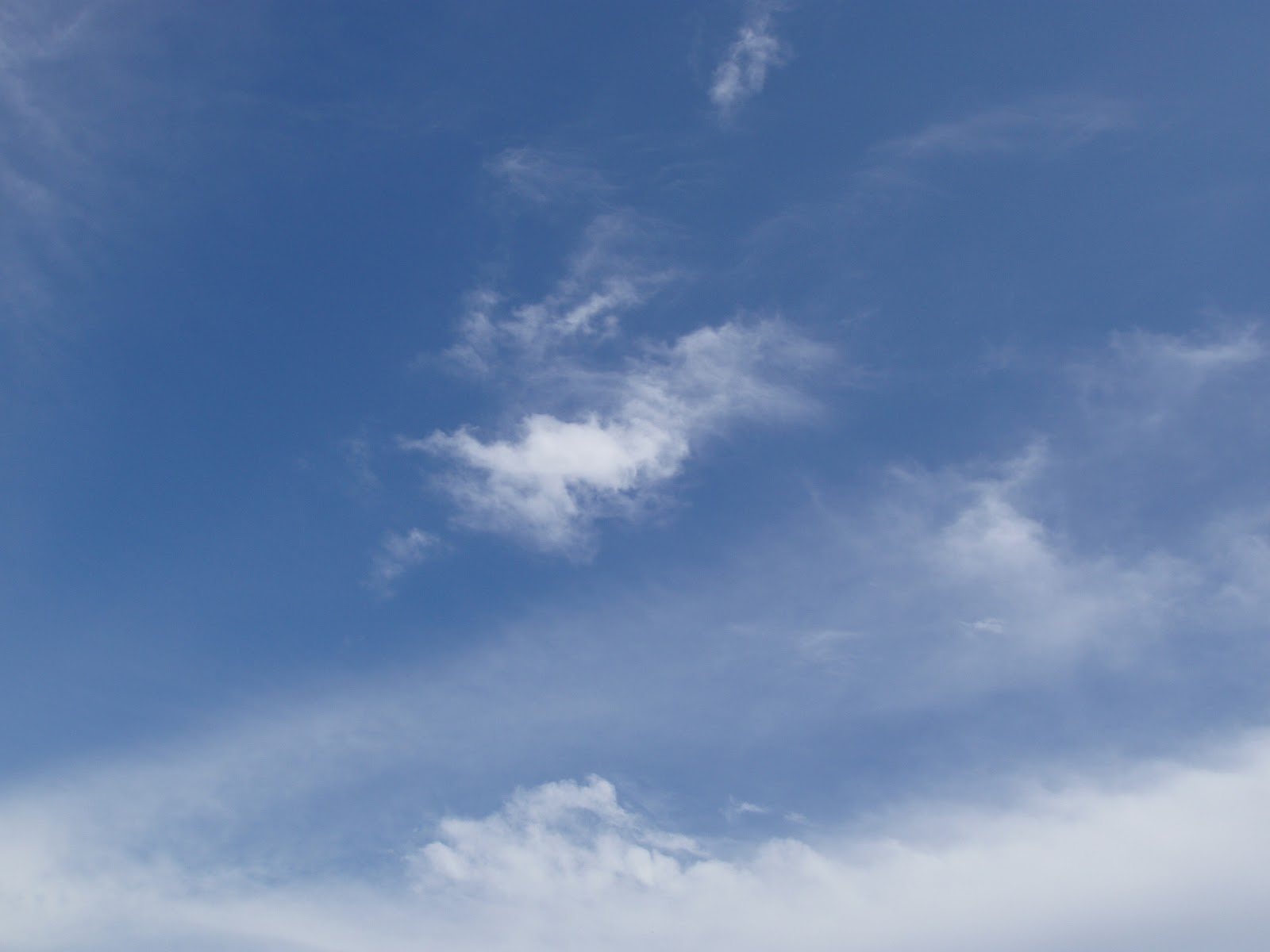
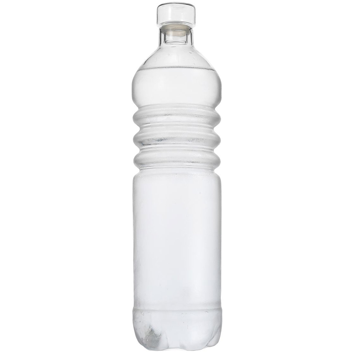
I created numerous layers where I started with a background layer - a picture of water with a floating glass bottle in which I removed, and the sky including the clouds. I then used a picture of a large waterfall that I used the Clone stamp tool to clone the waterfall itself to place in the middle of my project.Then I placed the Statue of Liberty with the earth using clone stamp tool again to remove building around bottom of Statue of Liberty and then I did same procedure and  added more bubbles. I cut out recycable bottles laying on bottom of water using the pen to draw around and then feathered and made selection - finally using magic eraser tool to get rid of most of background and then eraser tool to do detail work around after increasing size of object. Did same for plastic recycable sign, and plastic bottle - Statue of Liberty is trying to hold up a plastic bottle showing that we need to save the planet by recycling plastic bottles and not litter. Also, the earth and Statue of Liberty are underwater because if we don't all conserve then we can be heading in the wrong direction when it comes to our environment - we live in together. The objects around hand was done with same eraser tool procedure and placed like it was picking up the bottle to help with idea to reduce litter and help to recycle plastic bottles. Then same procedure done on glass bottle and pitcher to get rid of surrounding colors and background. This signifies the reusable glass bottles and use of a glass pitcher where it promotes idea of reusing to help save the environment and our planet.

Text font = Latha/Bold/Size= 36 pt. and following text effects and tools used:
1. 'Save our planet' - Warped text
2. 'Recycle' - > Layer > Type > Warp Text > Style: Flag/Vertical/Bend= +92% /Vertical Distortion = -30%
3. 'Reduce' - > Layer > Type > Warp Text > Style: Bulge/Vertical/Bend= +29% /Vertical Distortion = +8%
4. 'Reuse' - > Layer > Type > Warp Text > Style: Wave/Vertical/Bend = -46%/Horizontal Distortion = +1/
    Vertical Distortion = +39%
5. "H2O" (bubble style font used for underwater) - Drop Shadow --> Multiply/Opacity= 15%/Angle = 73 degrees/Use Global Light/Size = 13 px/Inner Shadow --> Overlay/Angle = 49 degrees/Use Global Light/Distance = 1849 px/Size = 1 px/Inner Glow --> Overlay/Opacity = 75% / Technique = Softer/Edge/Size = 16 px/Range = 50% /Satin/Bevel and Emboss --> Style = Inner Bevel / Technique = Smooth/Direction = Up/ Size = 21 px/Shading Angle = 49 degrees/Use Global Light/Altitude: 37 degrees/Overlay/Opacity = 44% /Multiply/Gradient Overlay/Satin --> Overlay/Opacity = 50% / Angle = 19 degrees/Distance = 21 px/Size = 13 px/Invert/Gradient Overlay --> Overlay/Opacity = 45% / Gradient = Reverse/Style = Linear/Align with Layer/Angle = 105 degrees/Scale = 100%

Works Cited:


http://www.123rf.com/photo_11432011_blank-background-paper-spiral-notebook-in-hands-isolated-on-white.html


December 8, 2011

Lever - Final Digital Enhancement...


Final Digital Enhancement Project Below:

Enhancements Made to Final Project: 
I created many layers where I started with a background layer where I made adjustments to hue/saturation - fine tuning colors. I used elliptical marquee tool to draw the snowman where I filled bottom and top layers with white and filled middle layer with a blue hue. The filled colors in drawn round circles - added a glowing snowman. Then I pasted into bottom layer of snowman the Biltmore House and used blend mode - dissolve and decreased opacity to 94%. Then I added 30% noise with settings for Gaussian and Monochromatic to make it look like a snow globe. Next I pasted into middle layer of snowman the scenery blended by using Drop Shadow, Outer Glow, and Bevel and Emboss while adding noise and used same settings as bottom layer. For the top layer I drew red scarf, orange carrot nose, black eyes and mouth with brush tools at 15 pt. including arms and bottom white snow. I added hat to top of layer. Then created text style Rockwell Extra Bold at 36 pt. (green) by using blending options outer glow, bevel and emboss: contour and texture. Seven snowflakes were used and no blending options for grey looking ones; however for white ones used blending effects of inner glow and for blue looking ones used blending options: inner shadow and inner glow.


Original Project Below:
                                               

November 28, 2011

Lever - Preliminary Digital Enhancement

     I plan on digitally enhancing my first project, photomontage, using many techniques. The idea that the first project was about Halloween using the Biltmore House located in North Carolina; however, this time I used the Biltmore House focusing on a holiday theme. I used the moon and not the harvest moon. I used Santa and his reindeers and not a flying witch on a broom. I created snow globes inside a glowing snowman that illuminates...making a snowman signifies the holiday times and winter season. Enjoy!


Works Cited:
Biltmore House (see below) and the following images:


http://wallpaperschristmas.blogspot.com/2010_12_01_archive.html
http://www.clker.com/clipart-16552.html
                                             
http://www.clker.com/clipart-9907.html
 
                                                  
http://www.clker.com/clipart-snowflake-3.html  

                                                                                                                                                             http://www.make-it-do.com/make-it/make-it-a-snowman-kit/

November 22, 2011

November 14, 2011

Lever - Preliminary Rebook cover...

     The book, “What Should I Do with My Life?, by Po Bronson is a book that tells the real stories of many individuals that have asked themselves this question and to find the ultimate thing in their life they should be doing - when it comes to a career that they enjoy and their passion. I read the book and I found myself doing the very same thing where I asked myself this very same question...so I needed to find my own answers. I thought about where my life was going and I was ready to make the next move? At the time I chose this book, I wanted to finish my education that I never did complete, so I went about my journey and this should be my last class this semester. Did it answer the question or just offer more questions? I think the saying and the book color has more power than the text itself. So I would like to change the background color (to a lighter color – maybe blue or white) or place a textured background. I will design the text using shiney 3D text effects to signify depth and that it is glowing just like what one should really be reflecting on in a lifetime…just like the book. Also, I would like to create an image of the author Po Bronson in the earth with the part of title of book "My Life? just above the image to help bring out the importane of him writing this book. The author went about his journey to ask other people (the image used on the bottom) this same question because he asked himself it too, and he deserves to have his picture centered in the world globe. The globe represents those who are living all around the world and his image depictis the enjoyment of this journey and also in one's life!


Works Cited:
Wong, Victoria. Image, 2002. Web 11 Nov. 2011. <http://www.amazon.com/What-Should-Do-My-Life/dp/0375507493>.


November 8, 2011

Lever - Final Poster

October 31, 2011

Lever - Preliminary Poster

     I would like to create a poster for a social issue promoting to young girls that they can learn and enjoy math. Mathematics can be defined as the general science of structure and pattern and since art involves patterns and structure too both these subjects art are so interconnected. For example, fractals (repeating geometric pattern) can provide amazing illustrations of mathematics in action showing patterns, symmetry, structure and the beauty in itself. I will show this beauty in my poster work using a fractal image. The beauty of mathematics used for art in the poster will send a message that math is fun. The combination of type and imagery will help promote this message to the targeted audience. It is very important to encourage girls to study mathematics since I have come to learn that math and art are o intertwined that the message is to growing girls to study math too and to have fun with it too!
  
                                                                                             
 http://www.clker.com/clipart-stick-girl-yellow.html


http://www.clker.com/clipart-style-equals.html


http://tethered2home.com/?cat=13


   http://www.clker.com/clipart-12289.html